BasisDesign System Generator
What it does for you
Turn visual foundations into a themed component library with inspectable tokens and portable exports.
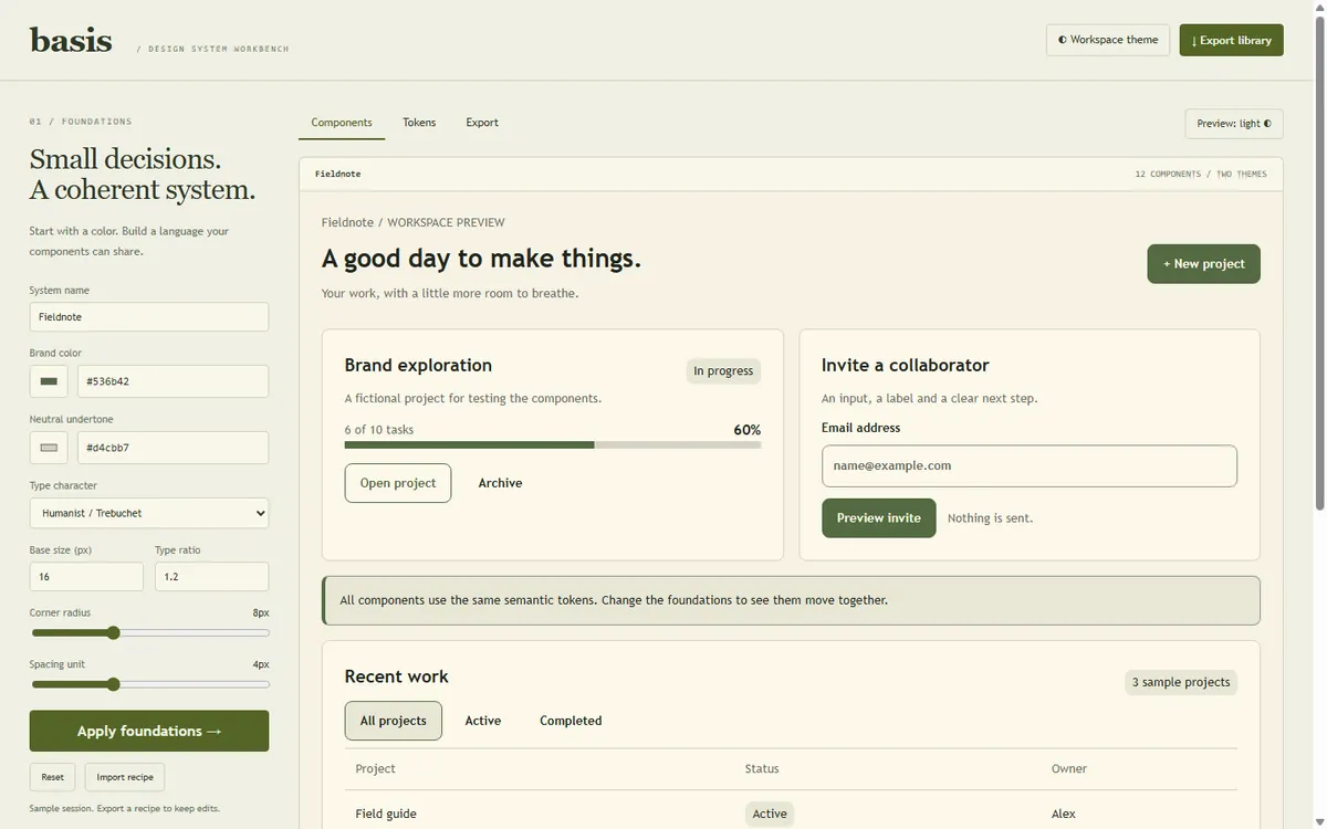
Screenshots
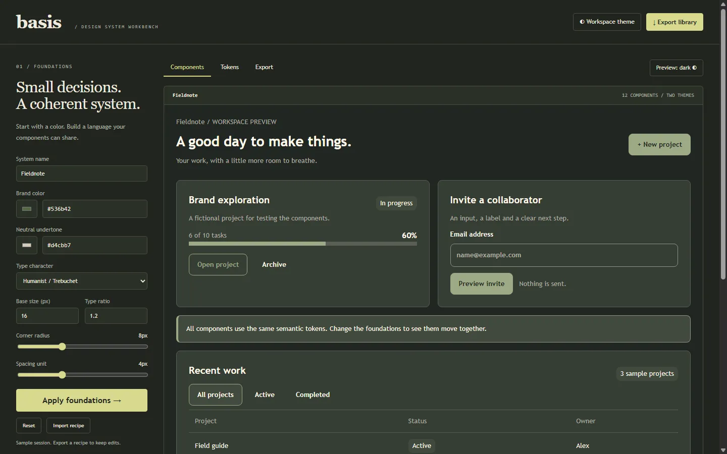
In more detail
Basis is a workbench that turns a few visual choices (brand colors, type sizes, spacing, corner radius) into a reusable component library. You see buttons, inputs, cards and error states update live in light and dark. Then you download the whole thing as a ZIP a developer can actually use.
Honest limits
The React source was reviewed but never compiled or mounted in a real React app. The color audit is not an accessibility certification; it checks 18 color pairs, nothing more. No external component registry or AI service was called. The 41 checks pass, the ZIP extracts cleanly, and Chrome checks covered filters, themes, bad input recovery and a 390 px width. It is still a workbench, not a hardened design tool.
How I built it
Codex built this one on September 23, the day Claude Code and Codex worked in tandem off a split file with two ownership lists. Basis was on the Codex list. Codex wrote its LOG-ENTRY.json in the project folder and never touched the shared tracker. Claude Code re-ran the checks, looked at the screenshots and merged it. The tracker logs it at about 0.18 hours.
I set the design-system scope and the polish bar. Codex wrote the color math, the token derivation, the scoped component styles, the preview behavior, the code generators and a small ZIP writer with no dependencies. It kept everything local and labeled the sample content as fictional.
The export has seven files: CSS, token JSON, an editable recipe, a working standalone HTML specimen and twelve React components. A token explorer and an 18-pair contrast audit show exactly what the system produces.
What I learned
- A brand color is not automatically a readable button or link color. Basis keeps the original brand ramp intact and builds separate semantic roles that are adjusted against the backgrounds they actually sit on.
- Contrast decisions have to use the unrounded ratio. The two-decimal number on screen is just presentation; the pass or fail decision runs on the real value.
- The first audit missed a few real pairs, like the secondary button and validation text on their surfaces. Expanding to 18 measured pairs caught them.
- An export is a second product. Codex extracted the ZIP with the native Windows extractor and opened the exported HTML in Chrome, instead of assuming a clean download meant a usable library.
- Sharing the same component CSS between the live preview and the export means what you see is what you ship.
What carried forward
The honest-labeling habit here (fictional sample content, no external services called, limits spelled out) runs through all the Codex builds in this range, including #93 Wayfind and #101 Pit Stop. The contrast-first thinking also connects back to a pattern from June: the design hook in this repo rejects overused fonts, and every build ships dark and light themes, so color and type were already treated as rules, not taste.
If I took it further
I would add a small host app that compiles the generated React components and runs keyboard tests on them. Before growing the token schema, I would add alias tokens and migration notes so a team could update without breaking things.
#095 Built with Codex September 23, 2026 41 automated checks